Loan funnel optimization
- Project: Optimizing the loan funnel journey for customers interested in getting a loan
- Role: Lead Designer
- Date: Dec 2022 - May 2023
- Description: This project aims to improve the drop-off rate from the loans interstitial for loan alerts (currently 32%), meaning that we lose 120K score visits out of a total 355K clicks
The problem
The loans interstitial for loan alerts is currently experiencing a 32% drop-off rate, resulting in a loss of 120K scored visits out of a total of 355K clicks. This issue negatively impacts both user experience and potential revenue.
The goal
We aimed to improve conversion between the loans interstitial and the comparison table which could increase revenue.
For the business:
- Improved conversion between the loans interstitial and the scored loan table
- Increased revenue derived from improved conversion
For the user:
- Enhanced user experience, specifically addressing the frustration caused by the perceived 'stuck' or 'frozen' page during the loan form submission
- Reduction in waiting time without clear indication during the loan form submission process
The principles
- Instinctive with a TM twist
We create a recognisable experience using common patterns, while keeping our visual design distinctive and consistent.
- Encourage to empower
We create experiences that celebrate the customer on good days and support them on bad days.
- Personalisation with purpose
We tailor our product to our customers to help them achieve their unique goals.
We decided to tackle the lack of data resource with 3 tests:
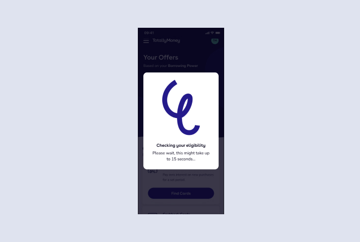
Loading
Hypothesis: Structuring loading experience and FE change will have an impact on drop-offs
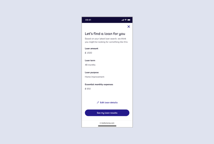
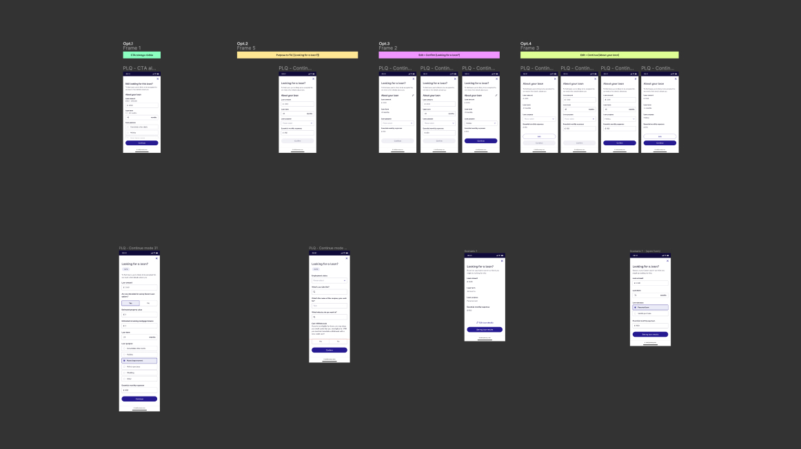
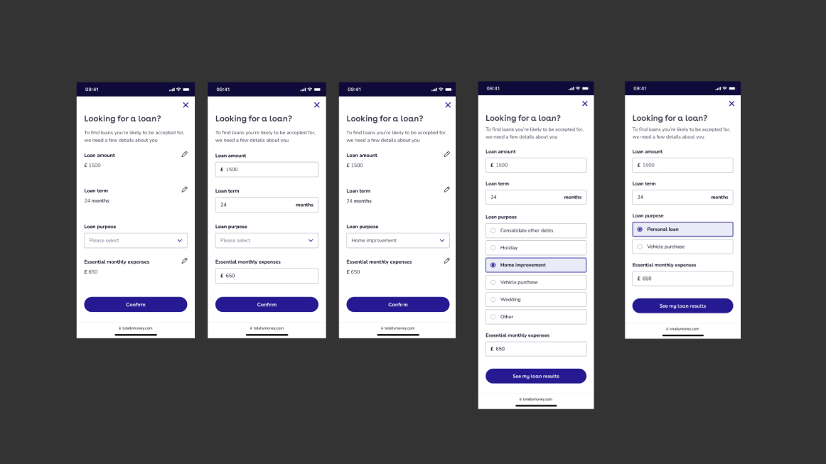
Pre-populate the form
Hypothesis: Creating a pre-pop journey and reducing the form length will positively affects engagement
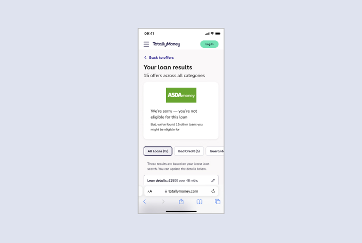
Straight to the loans
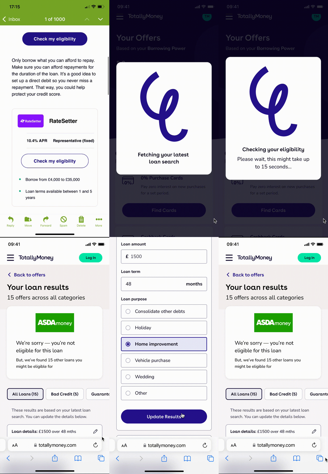
Hypothesis: Removing the form will decreases drop-offs, enhancing user experience.
The design exploration
Mobile first
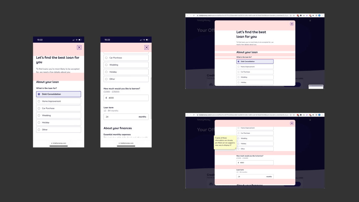
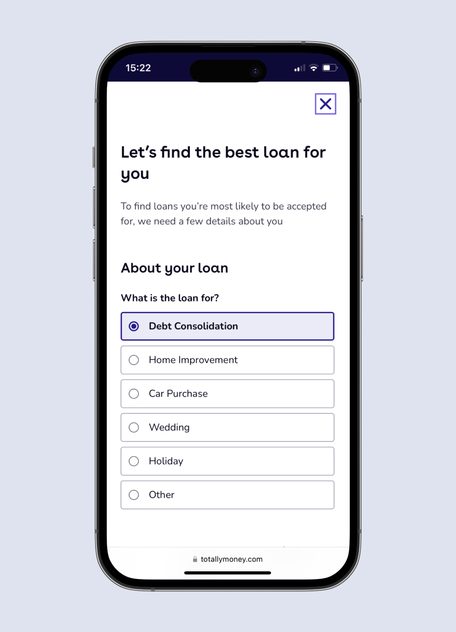
Since 60% of users access offers via mobile, we aimed to enhance the design for better retention and overall experience. So, following the UX audit, we wanted to concentrate on having the same hierarchy and copy on the web as well as on the app. We worked on aligning that while our engineers were working on ways to optimise the loading times.
Loading
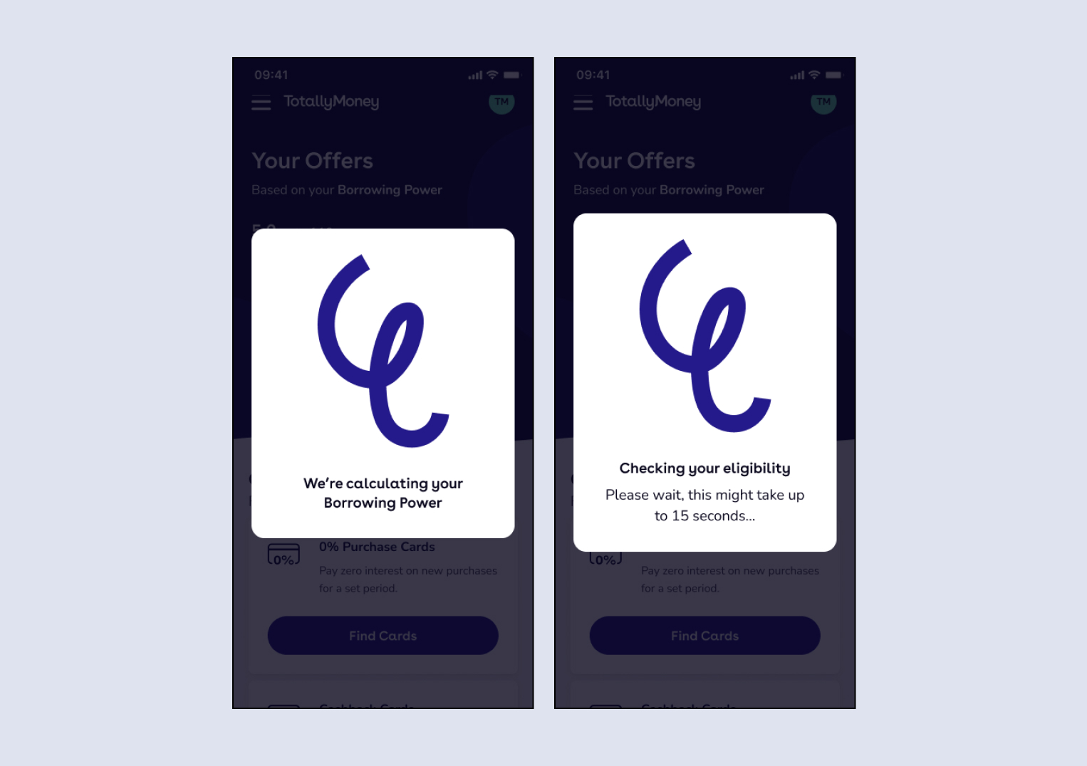
I closely worked with the copywriter to ensure customers have accurate expectations about the background page loading process, being extra-clear about the estimated duration. While aligning the brand vision on the web, both Front-end and Back-end developers focused on improving loading time and syncing with design development for a coordinated launch.
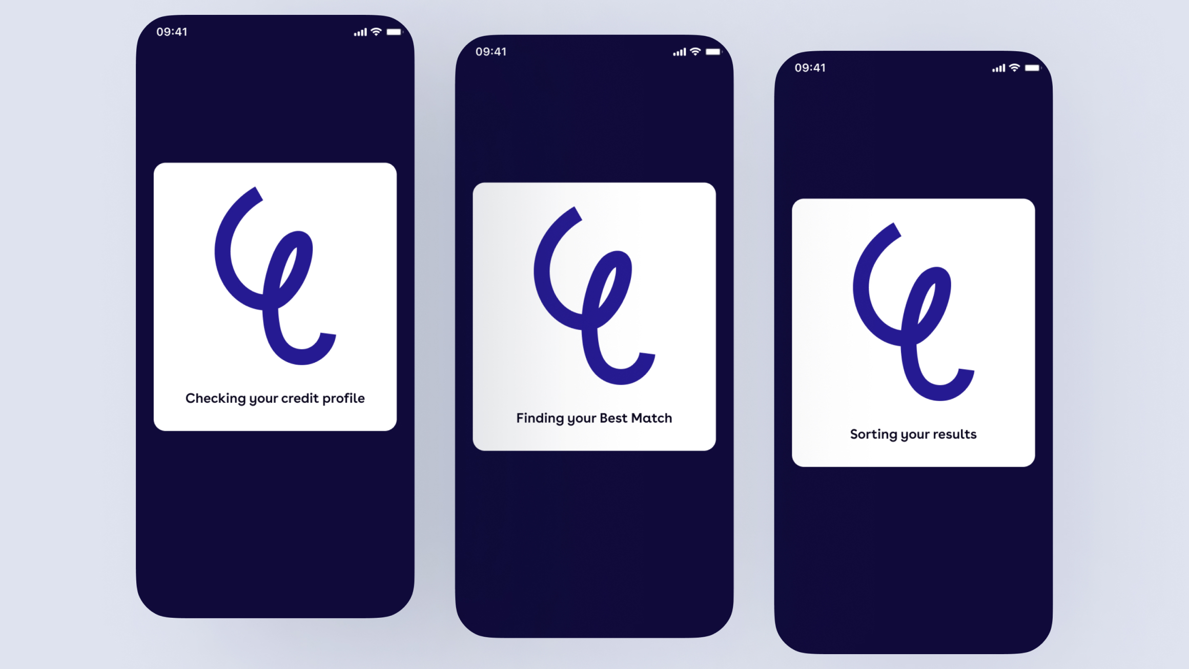
First test
- 62% of users successfully submitted the form, a 3% increase from the control
- 58% of customers reached the loans scored table, an 8% increase from control
- Based on this data, releasing the variant as the new control would result in 442 more customers reaching the loans table per email sends
Second test
- 74% of users successfully submitted the form, a 11% increase from the control
- 71% of customers reached the loans scored table, an 11% increase from control
- Based on this data, releasing the variant as the new control would result in 1000 more customers reaching the loans table per email sends

Third test
- Less customers submitted the form
- 75% of customers reached the loans scored table, an 9% increase from control
- Based on this data, releasing the variant as the new control would result in 720 more customers reaching the loans table per email sends
Business impact
While Test 2 was the most impactful of all 3 tests but we were confident that Test 3 has shown a more positive response, since we’ve seen an uplift in scored visit of 75% with Test 3 against a 71% with Test 2. After announcing Test 3 as the winning test, we have gradually released it to 100% and also released it on the app. This project helped shape future projects that use pre-pop as a way to personalise customer experience.
