Knowledge base
- Project: Knowledge base for Gravity
- Role: Lead Designer
- Date: August 2020 to Feb 2021
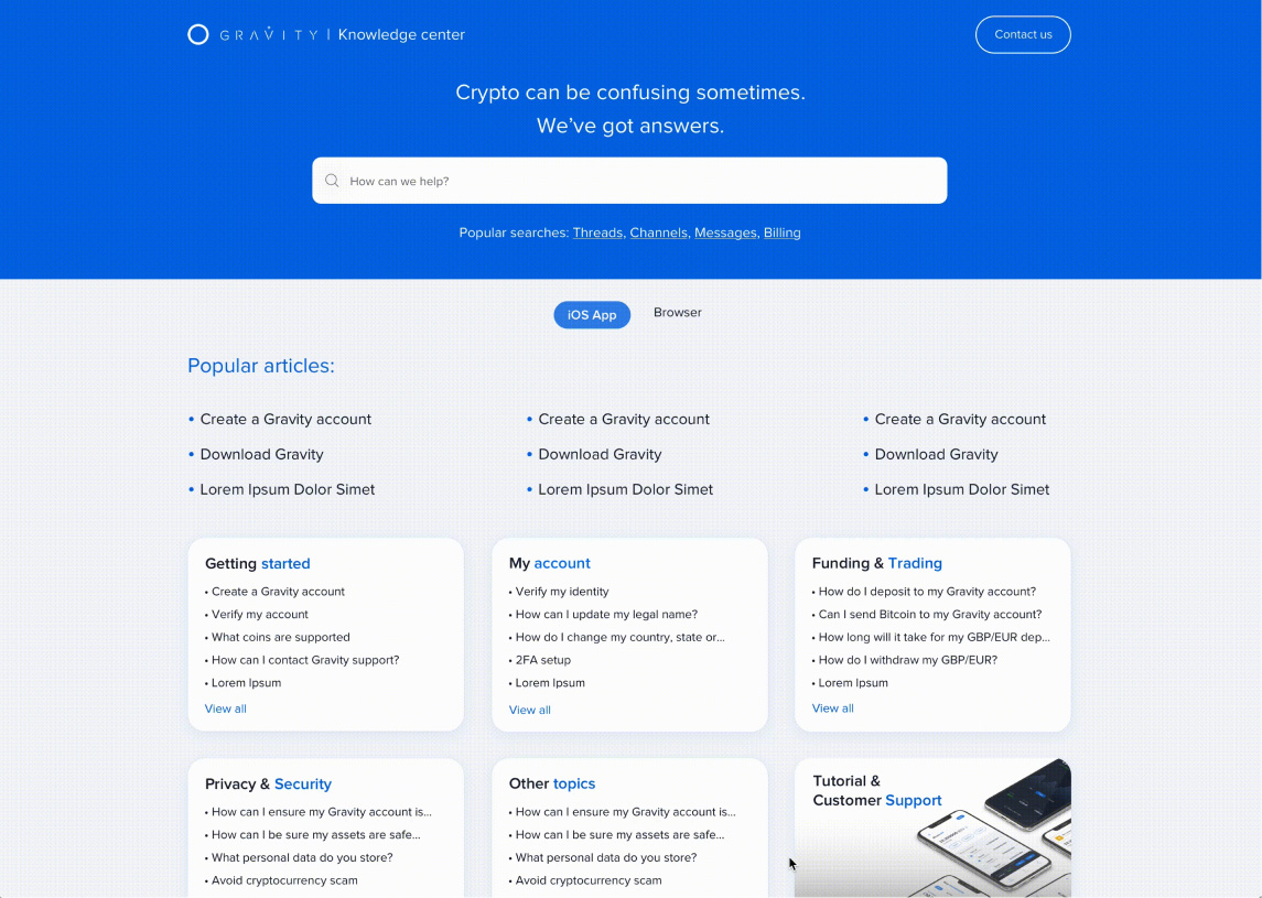
- Description: Just as Gravity users want to feel confident while using the platform, we want them to experience the same confidence and control when it comes to accessing information about the product. The Knowledge Base allows people to access FAQs in minutes, so they can learn more about the product without having to contact support.
The problem
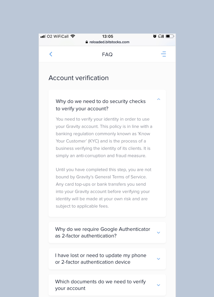
Users found it challenging to find answers on the FAQ page, particularly as this section was only visible for logged in users. After a meeting with the Support team we became aware that users found it challenging to find answers in our FAQs, particularly as this section was only visible for logged in users. As an intermediary between the Support and Product teams, I acted as the design lead for this project.
The goal
Make a ‘Knowledge Base’ accessible and shareable, so the Support team can better assist our users or potential users.
The research
What are the associated struggles of having a 'closed' FAQs webpage?
- Causing friction
- Restricted knowledge
- Fragmented content
- Accessibility issues
The principles
- Provide guidance
Providing guidance for a crypto system is not an easy job. Opportunities include guidance through better categorisation and a clearer Q&A section.
- Build for inclusion
Designing for inclusivity opens services to more people reflecting on how people really are and putting people in the center from the very beginning of the process.
- Give more clarity
Our users should feel like there’s no gap or lack of information. The website should include all the answers the user might need and should inspire trust in our content and data.
Key solution elements
- Searching tools
Having a way to better navigate through all the information needed a ‘compass’ so we decided to include a section on top where users could better access FAQs.
- Faster answers
Bringing on top of the page a section with the ‘Popular articles’ might decrease the amount of tickets the Support team receives everyday.
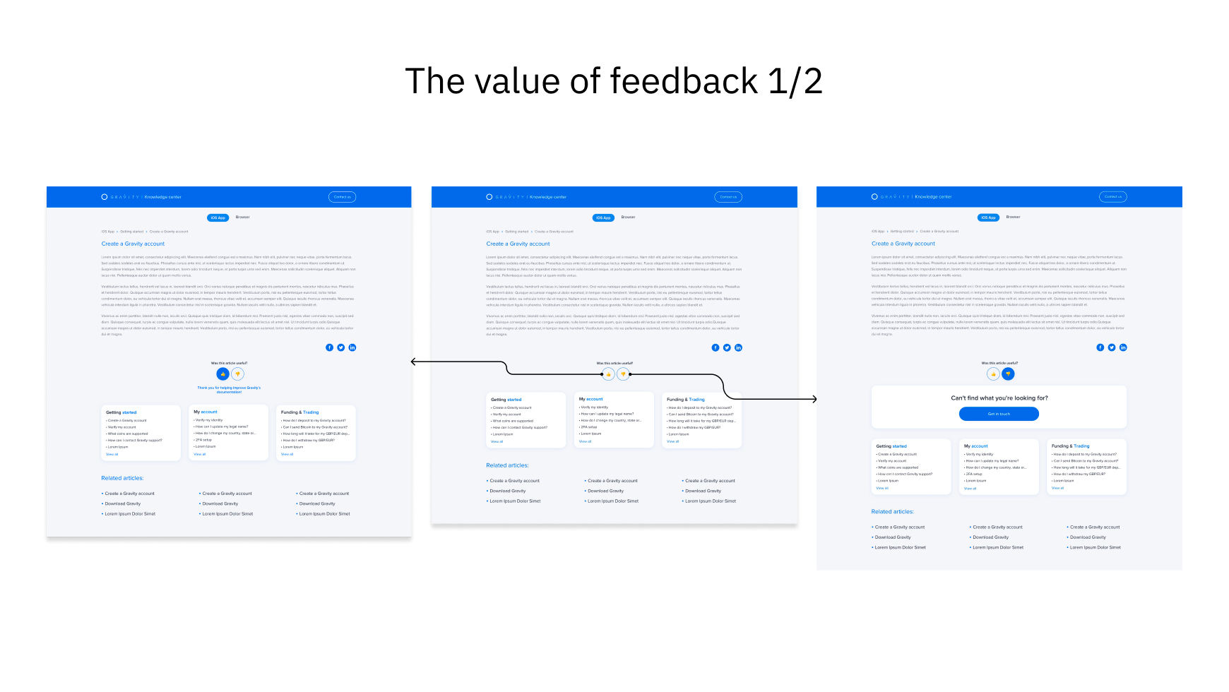
- Giving feedback
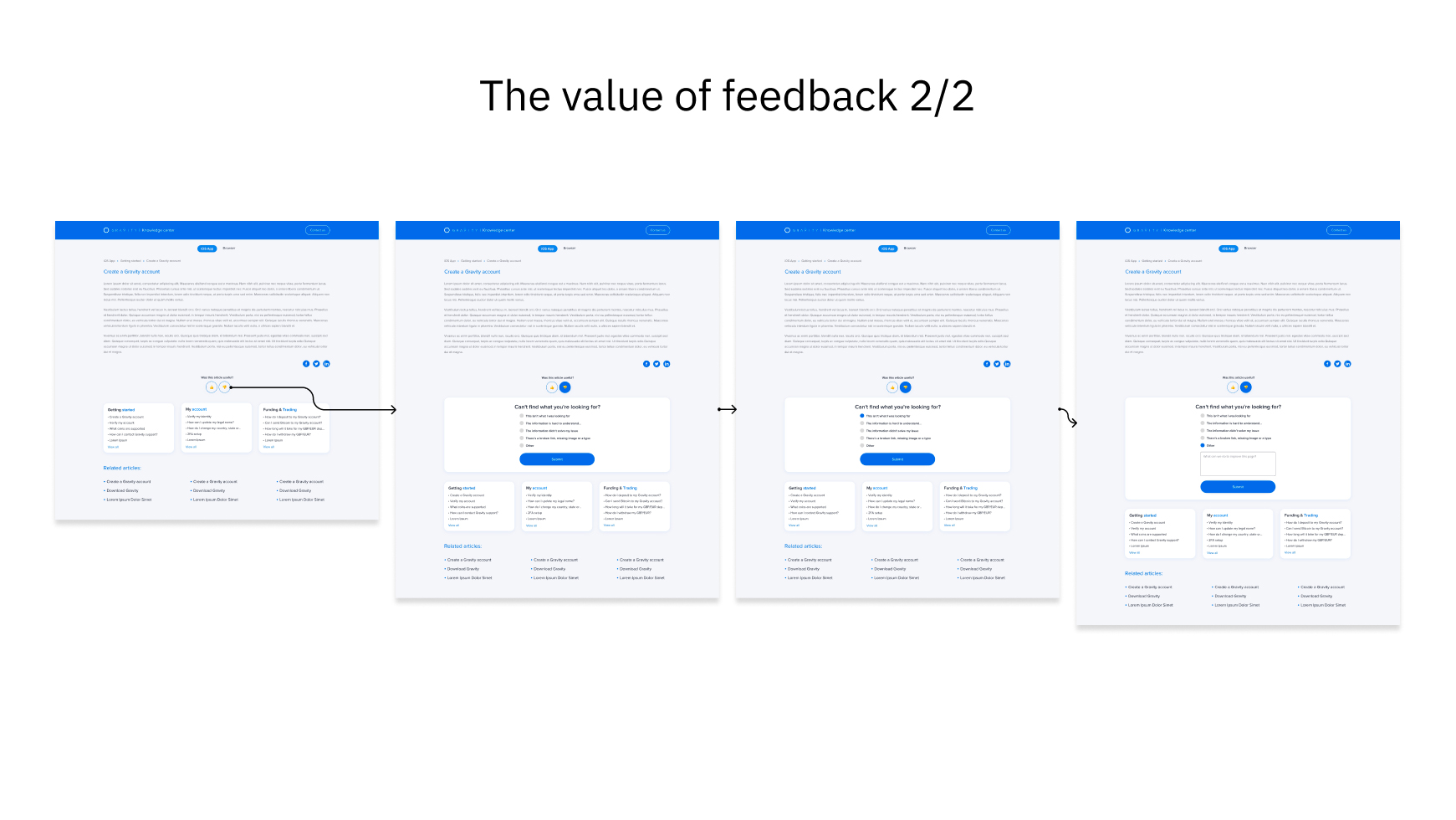
Positive and negative feedback will help us to better connect with users and will allow us to keep the website up to date.
- Familiarity
The interface should use terms and concepts which are drawn from the experience of the people who will make most of use of the Knowledge Base.
User testing findings
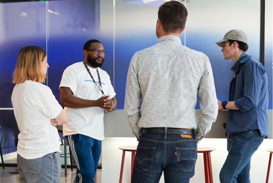
Frustration about not being able to see information
“Why can’t I access the information about Gravity if I am not a user? Why is this page so difficult to explore? Why can’t you share a link to the article?”

Search for content without contacting support
“It was easy to find the all the information I needed once I contected your support but I had some difficulties to find other information later on...”
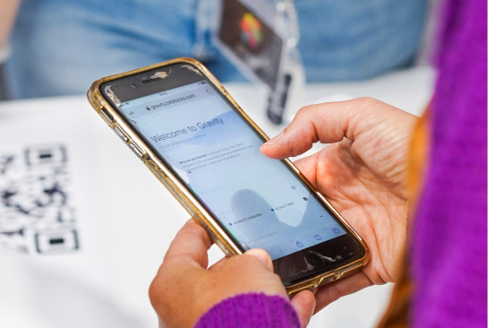
Confusion around finding the correct articles' categories
“It’s difficult to find answers with the categories being on the side like that... Why is there a similar article on two different categories? Which one is relevant in my case?”
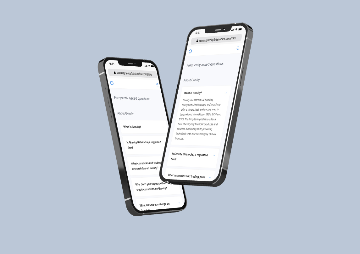
First Observation
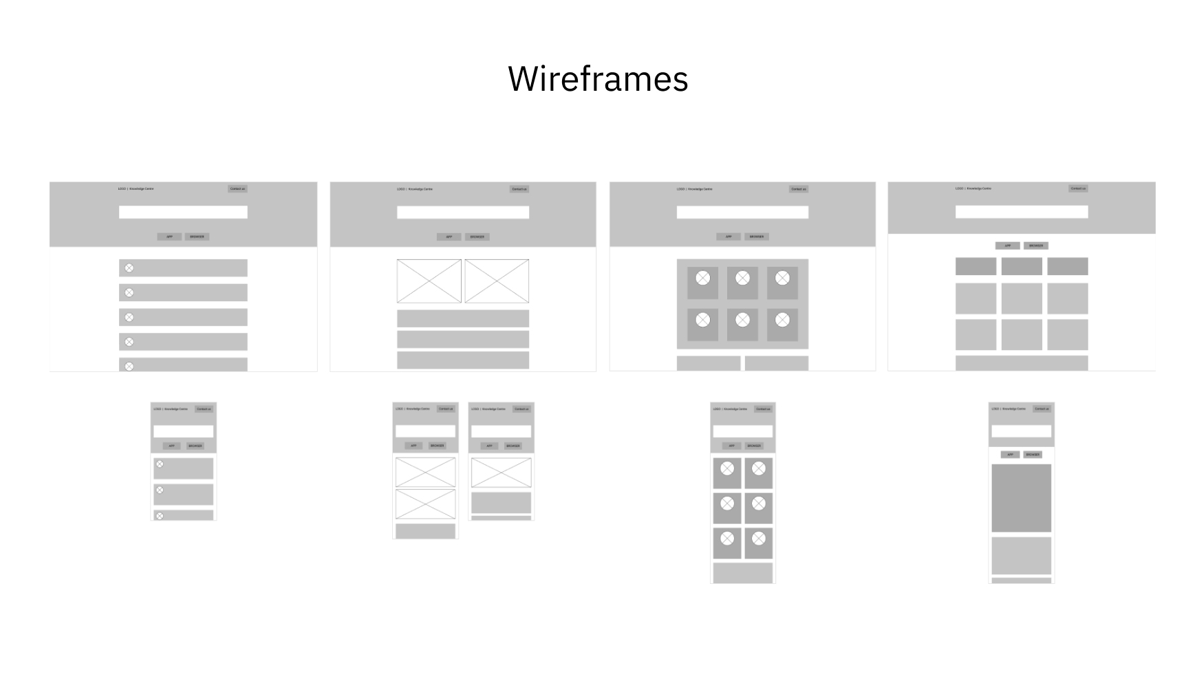
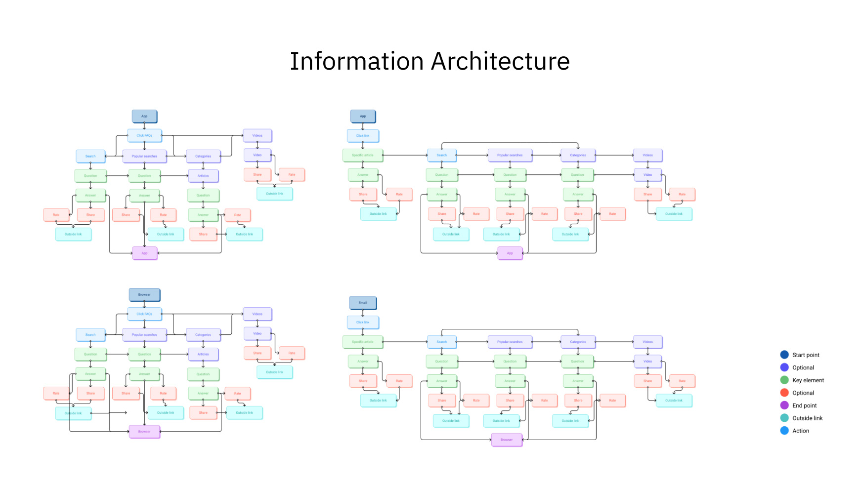
To kick off our designs, we first needed to consider the type of content, copy, and media we would need to account for. We started by reviewing a rough draft of the new content and then working with our copywriter to update the copy for the app section. While designing, I took into consideration all the information gathered during our usability test and started the research phase looking at great FAQs pages from companies like Atlassian and Shopify and then worked on the architecture to have a more ‘standardised’ webpage.
Challenges
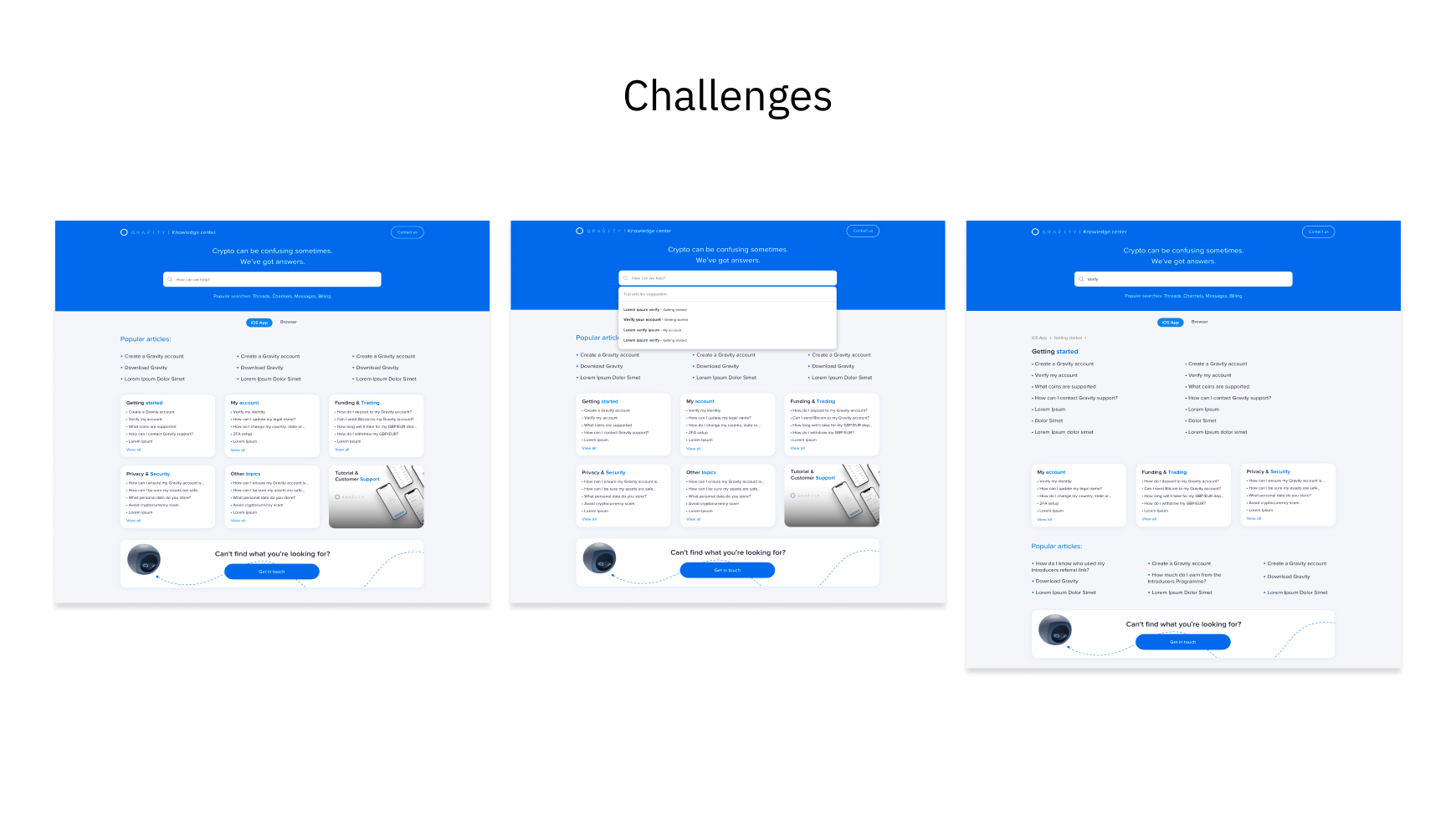
One of the challenges was creating a design solution that wasn’t overwhelming. Due to the nature of the Knowledge base, the design could easily get text-heavy and overwhelm the users. We actively tried to solve this by breaking content into sections, adding a video centre, and creating interactive feedback CTAs, allowing the user to tell us if the article was useful or not, with room for feedback.
The Value Of Feedback
After testing our initial design we tested the feedback section and we received suggestion about being able to express what it could be improved in the article without leaving the website. Most users felt the need to find a quicker way to give feedback otherwise they will not bother giving it. I extensively researched before coming up to a new solution.
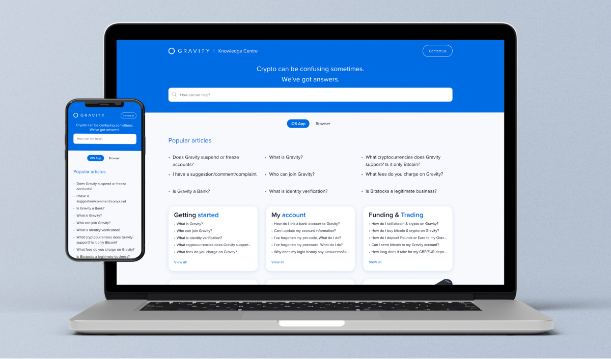
The final design
I regularly updated the team on the status of the project in Slack or during our design critique sessions to make sure everyone knew what was happening and that we stayed on track with our timeline.
After working on this project for 5 months, I announced the launch to everyone at Gravity. I fielded questions from Support on the project and received positive feedback shortly after, particularly with regards to the improvements in the overall experience for our Gravity users.
