Currency Page
- Project: Currency page for Gravity (browser &iOS)
- Role: Designer
- Date: October 2020 to Jan 2021
- Description: After some user research we identified that many users had concerns on the timeframes of certain actions and were losing trust in our product. We then had to act quickly to change this perception.
The problem
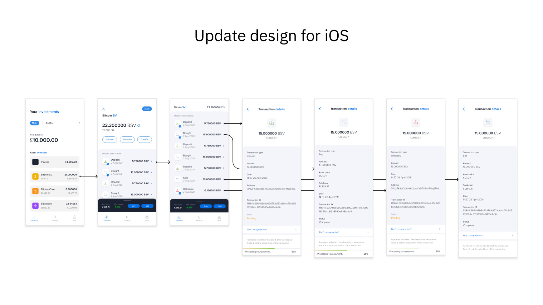
How to maintain the users’ trust that deposits and transactions will arrive in their Gravity account? During our move over from browser to iOS, we also decided to renovate the overall design since most of our traffic came from mobile users. I started this project by creating a new mobile currency page, adopting the iOS guidelines with an aim to create a unified experience.
The goal
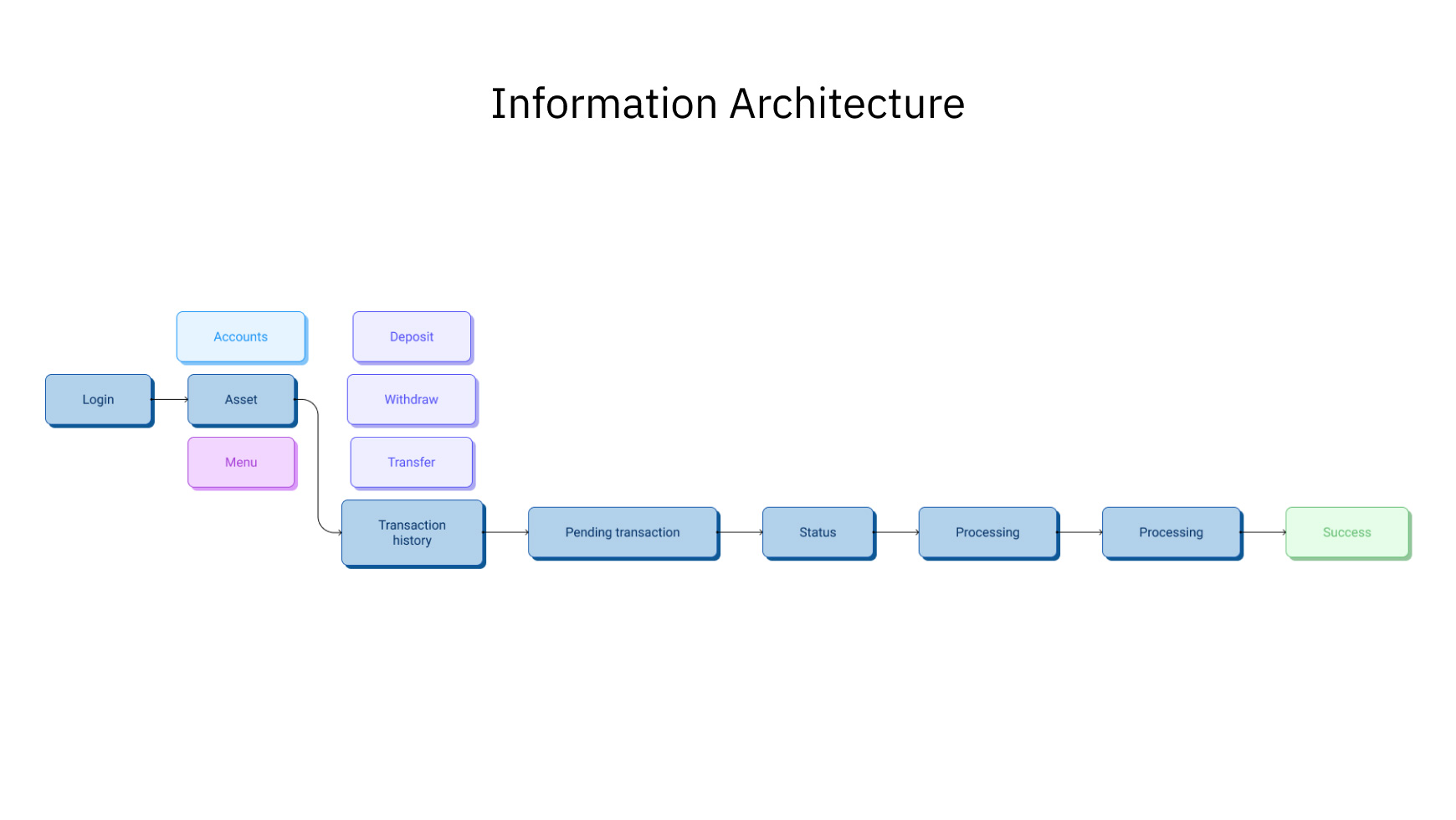
Create the right architecture with the objective of increased acquisition and activation.
The research
What do users feel the need to see first in their ‘Currency page’?
- Create awareness about why deposits are not showing
- Confusion around why their transactions are not showing
- How to maintain the user trust that transactions will arrive
- Comprehension about how blockchain confirmations work
The principles
- Educate at the right time
We need to ensure that education is done in a timely and effective manner. Users should have very clear expectations of the length of time certain actions will take and how the blockchain confirmation steps work.
- Transparency builds trust
It’s crucial that we are empathetic and we understand our customers. It’s our responsability to be clear and transparent about their balance situation and how their balance is determined.
- Empowering users to trade
We should reassure users when their money is received and update their balance. Users need to be confident on how and when to trade. Having all the information in this page will help them to decide what’s best for them.
Key solution elements
- Informed deposits
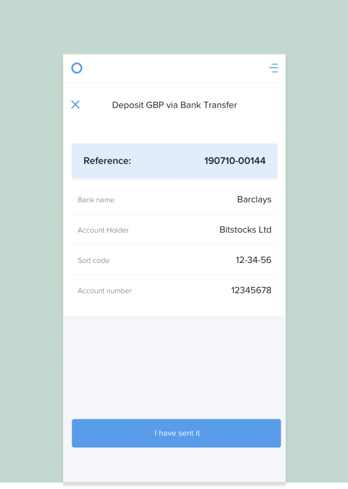
Providing the users more information about their first deposit, which might take up to 24h, informing them in advance so they don’t wonder why the balance is not updated.
- Pending transactions
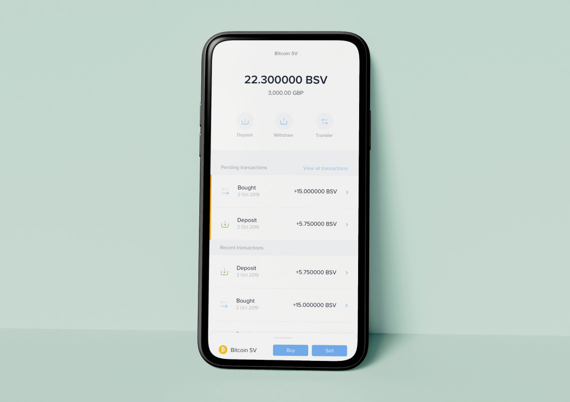
Showing the pending transactions on top of their history will give the users a quicker way to monitor their balance and an easier way to access it.
- Live price chart
Having a way to be constantly updated on the market status is something key to save them time and stop switching between different platforms.
- Price alerts
While we provide an overview on the market, we’re also giving the flexibility to quickly buy and sell at their target price.
User testing findings

Information before depositing is essential
“I just deposited some pounds, where is my money? Where will it be available in my balance? Why can’t I find it in my transactions history?”

Pending transactions are hard to find
“Why can’t I see that the crypto I just bought/sold in my history? Why can’t I use my coins straight-away? Why does it say ’pending’?”

Users needed reassurance after each deposit or withdrawal
“I just withdrew some money but I didn’t receive any notification, how long it will take? Why is it not instant like my bank? Why do I have to wait so long?”
First Observation
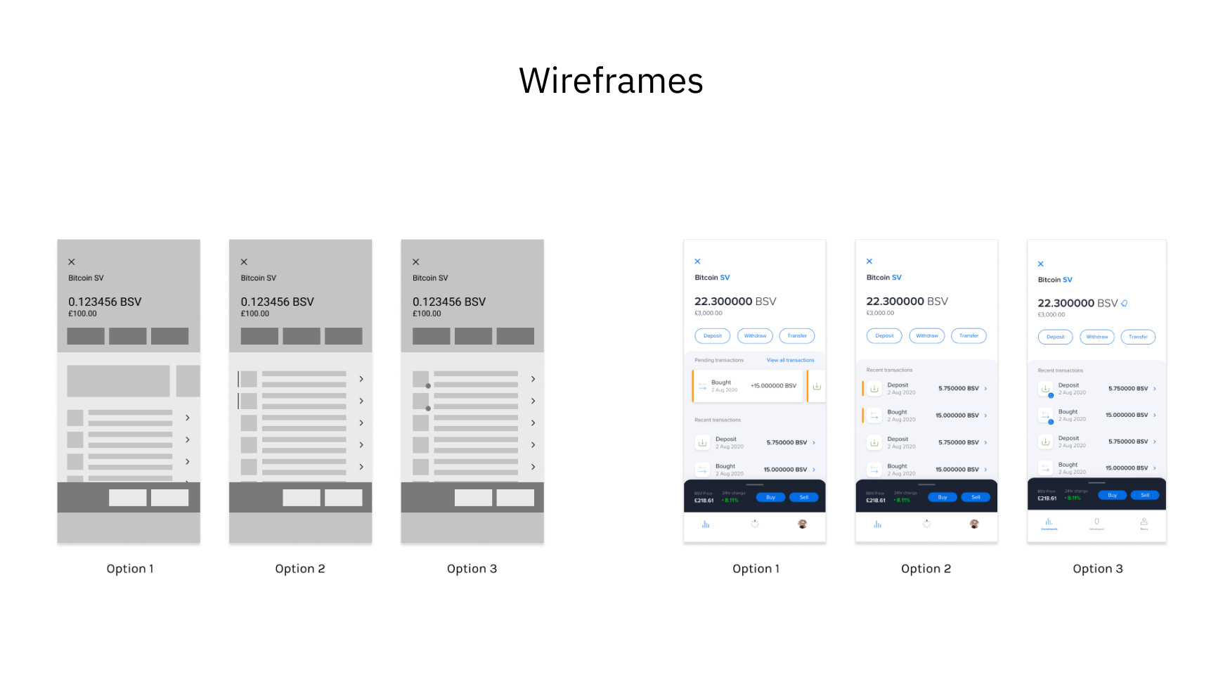
I initially explored many options but after a meeting with our engineers, they suspected that trying to separate ‘Pending Transactions’ from ‘Recent Transactions’ would be challenging on their part so we explored a version where we could use UI to merge them.
We also decided to quicky fix confusion around deposits and withdrawals by adding a brief message so the users will know beforehand how long it might take.
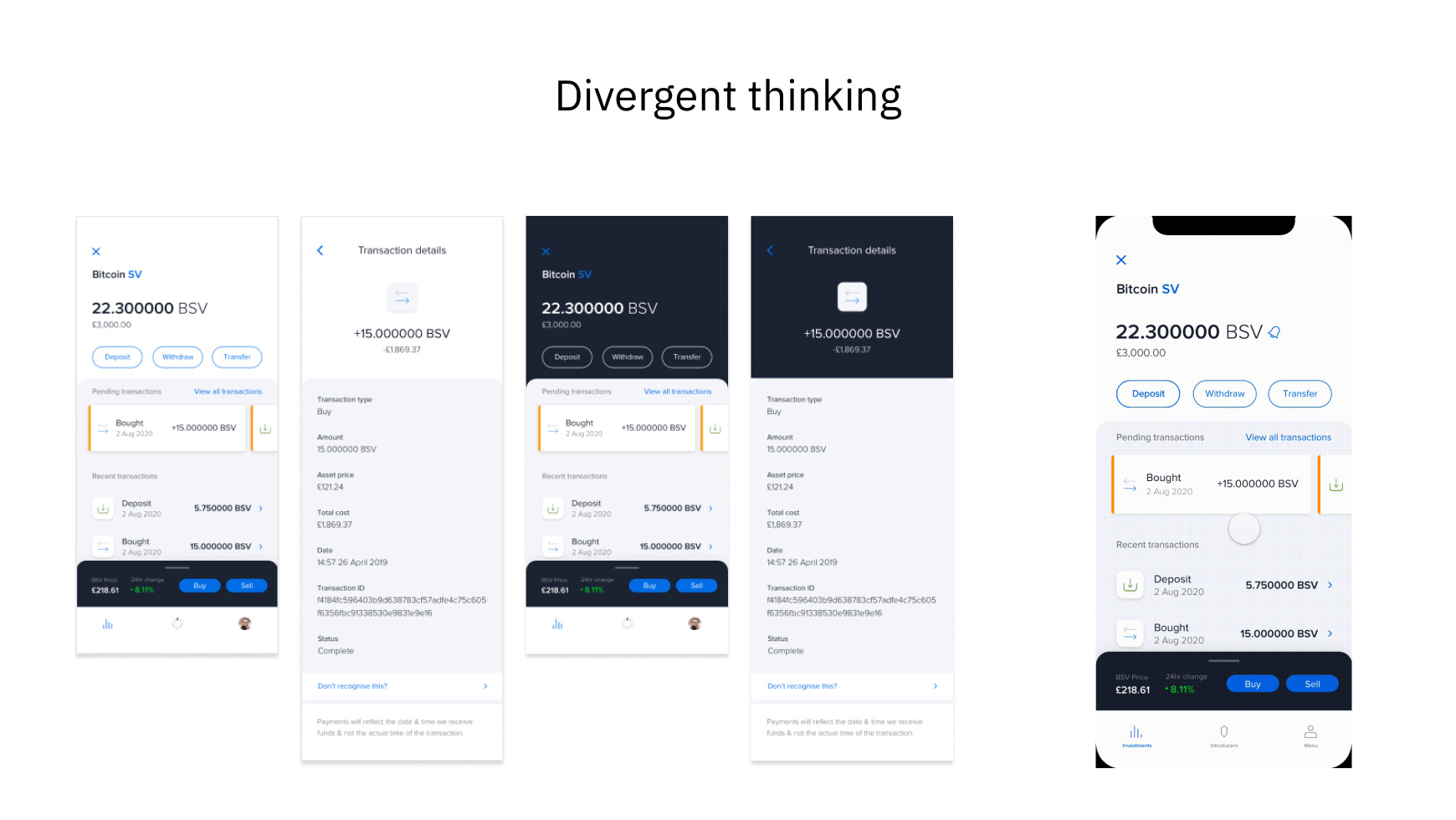
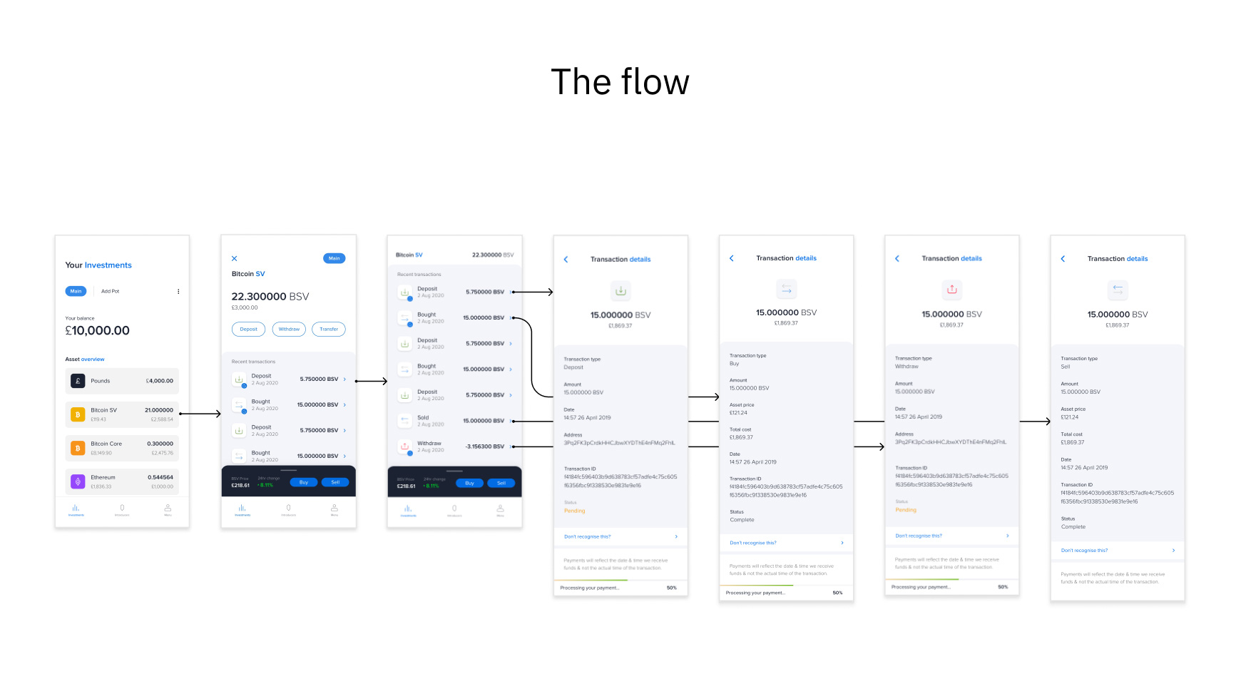
As a part of our design review, I decided to do divergent designs and to explore possibilities and as a result, this section is a quick and creative exploration of how the visuals could come together. I conducted a walk-through and sense-check of the entire flow and interlinked pages. This identified that our blue colour was impacting the flow, making information less clear. I was relieved to find that the team agreed.
The final design
To the point
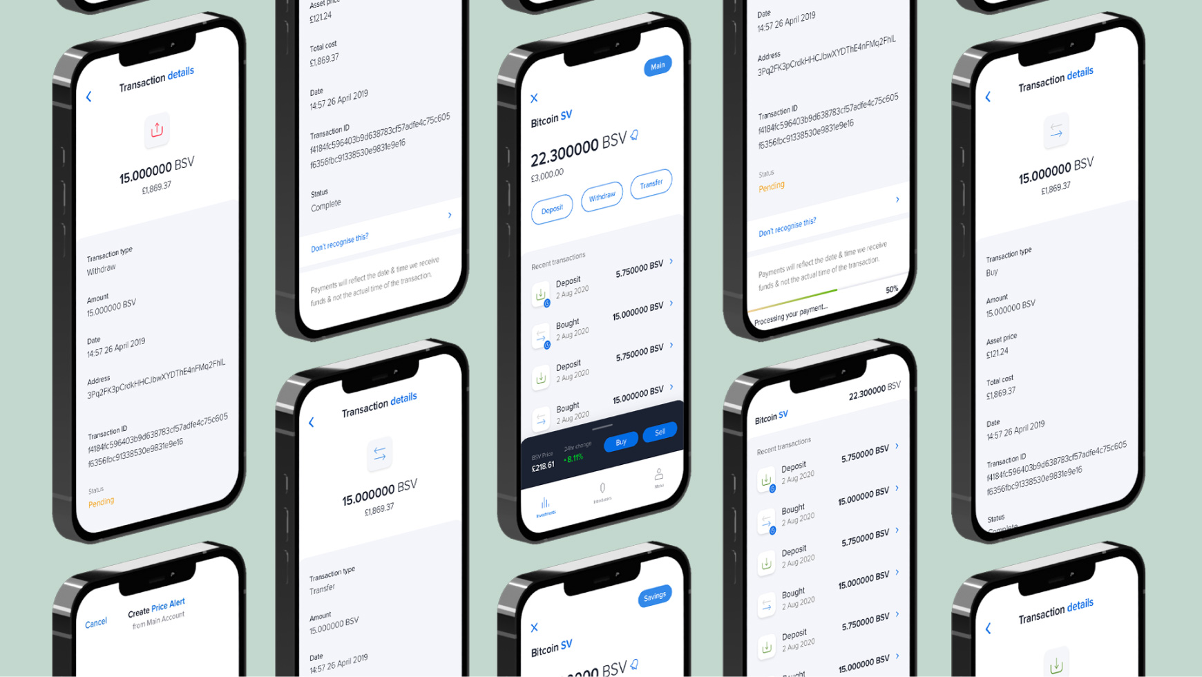
At any time the user will have all the information about his/her account visible instantly avoiding any confusion on which transactions are pending and which ones aren’t. We also decided to implement a partial scroll of the page and retain the balance on top so the user could scroll back up with ease.
The feedback we received from our users was extremely positive, with many noting the improved overview of their pending funds. Beyond a boost in positive feedback, we’ve also seen an engagement increase from users as a direct result of rolling out this new design.
